Modal
2023
Background
Modal is a cloud computing platform that lets users run infrastructure for AI and ML specific processes. With an existing user base and partnerships with enterprises, there was clear product-market-fit early into its lifecycle. The team at Modal needed help moving their MVP from 1 -> 2 in order to iron out some kinks in the overall experience and prepare it for general availability.
Solution
Upon joining the team I performed an audit of the existing product to identify areas of both friction and opportunity. Working with engineering I overhauled the core user experience, set up a scalable design system to codify the interface, updated the marketing pages to communicate product-market-fit, and improved the documentation experience, a key touchstone for Modal users.

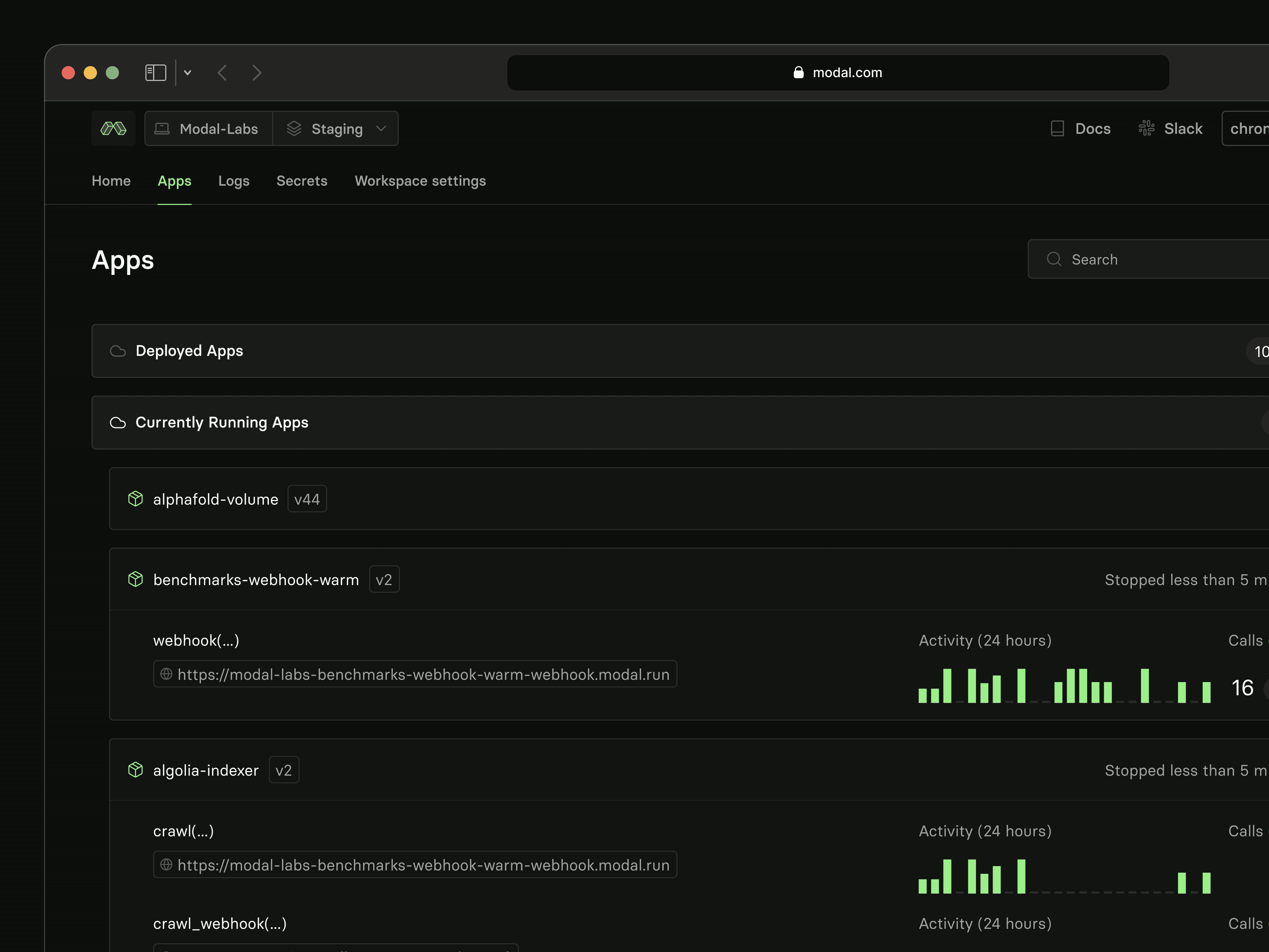
Apps page outlining all apps deployed on Modal's infrastructure
Product
Developers deploying their ML and AI-oriented applications are forced to account for complex infrastructure (Kubernetes, Docker, AWS) and scale when navigating the cloud. How do you help them deploy quickly and manage efficiently? Design’s goal was to provide a simple surface, taking infrastructure out of the equation, so devs could focus on building.

Logs describing processes related to specific apps
Token creation modal
Configure and verify domain modal

Usage and billing area within settings breaking down overall usage and related cost
Design System
Capturing all recurring styles and components, this design system was intended to require minimal maintenance and act as a springboard for design exploration.

Text and spacing styles

Schematics and renderings of common components such as tables
Button styles and variants
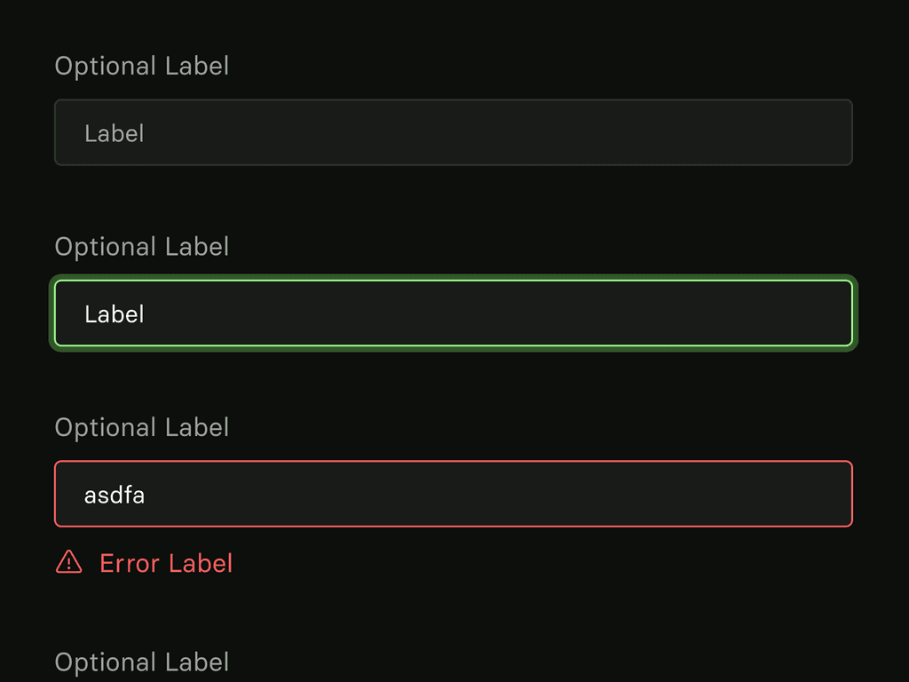
Text input styles and variants
Documentation
As one of the most regularly visited areas by users, documentation needed to be easily navigable and provide easy access to example code. Two primary layouts covered both reference articles as well as guides to common uses of Modal’s platform.

Two-column documentation layout

Single-column documentation layout
Marketing
The purpose of this redesign was to elevate existing marketing content while providing users with increased clarity in areas such as pricing and potential for increased conversion.

Various elements from marketing, blog, and pricing pages


